Everyday Health is a website that publishes a combination of uplifting wellness and factual medical content. As the lead UX designer for the site, my main roles were to drive site improvements by bringing the voice of the user to the table and lead key projects including redesigns of the Home page, Global Navigation, Photogallery template, Condition pages, and About Us page.
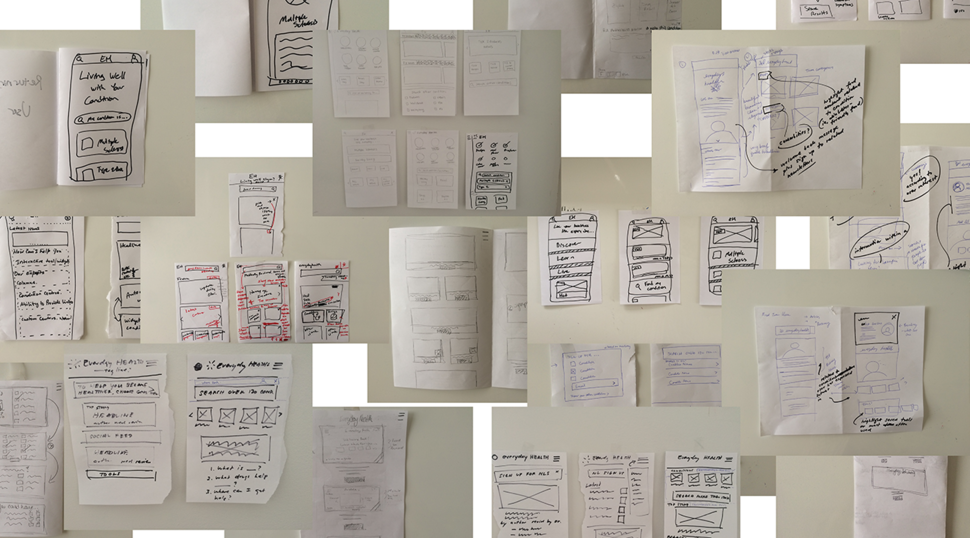
The projects were collaborations across product, editorial, engineering, audience, marketing and ad sales departments. This involved my leading design studios, collecting qualitative and quantitative data using tools such as Omniture, Google Analytics and usertesting.com, and wireframing concepts. Then after the visual design phases led by Selene Diaz, I would help write the user stories and acceptance criteria for the sprints.
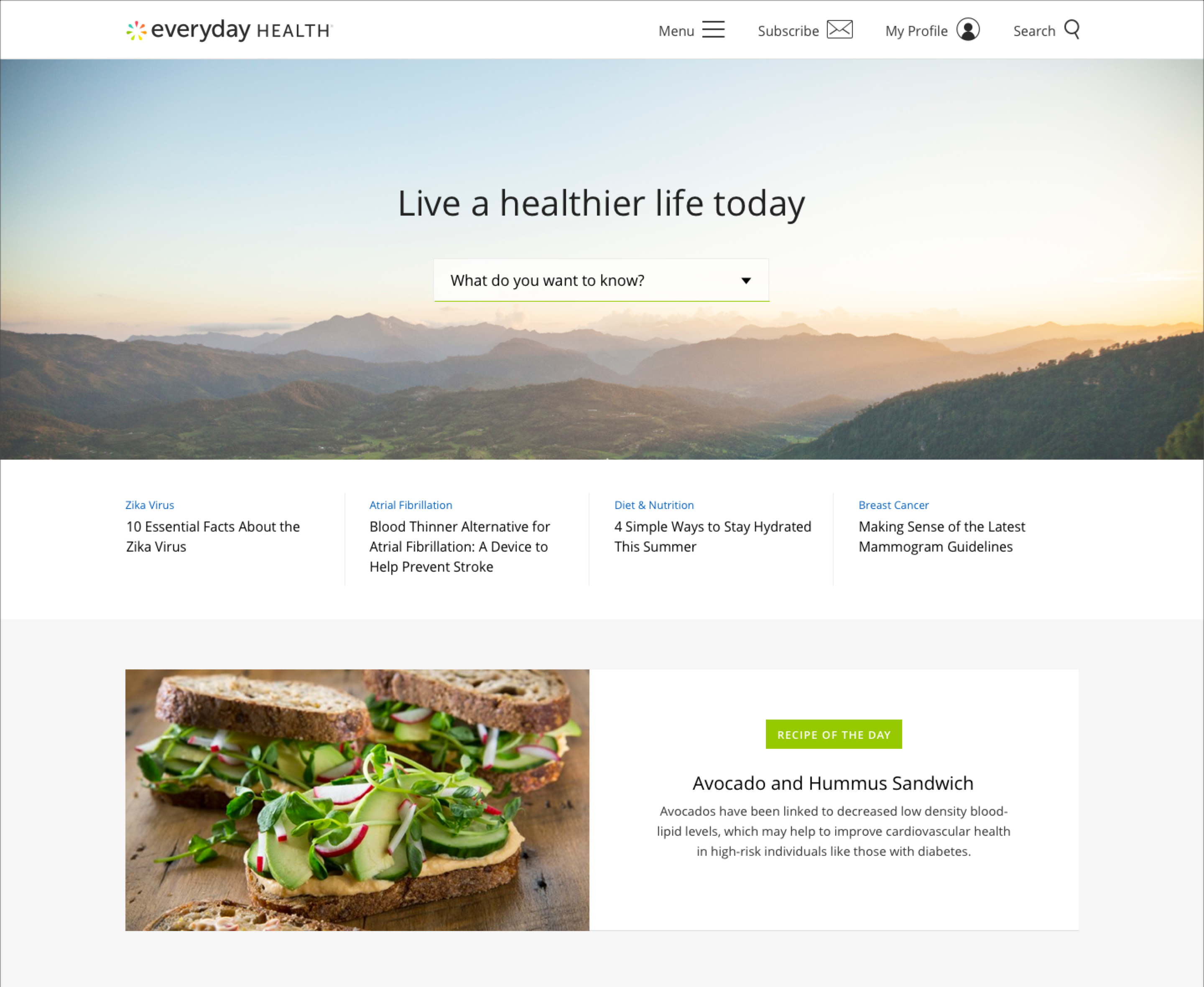
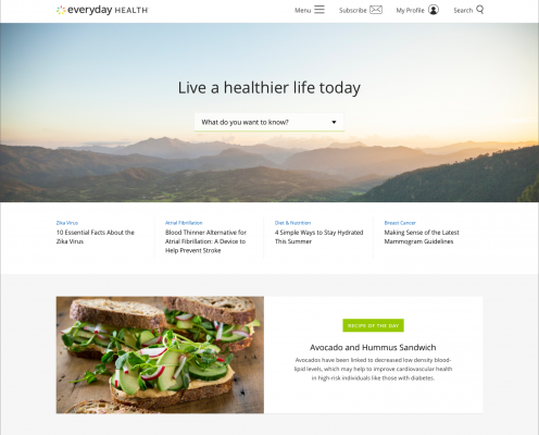
Home Page Redesign
The home page is where users normally go to determine whether the site is trustworthy after they arrive on a content page from a search engine.
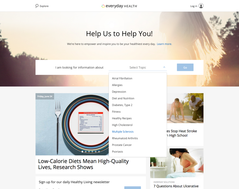
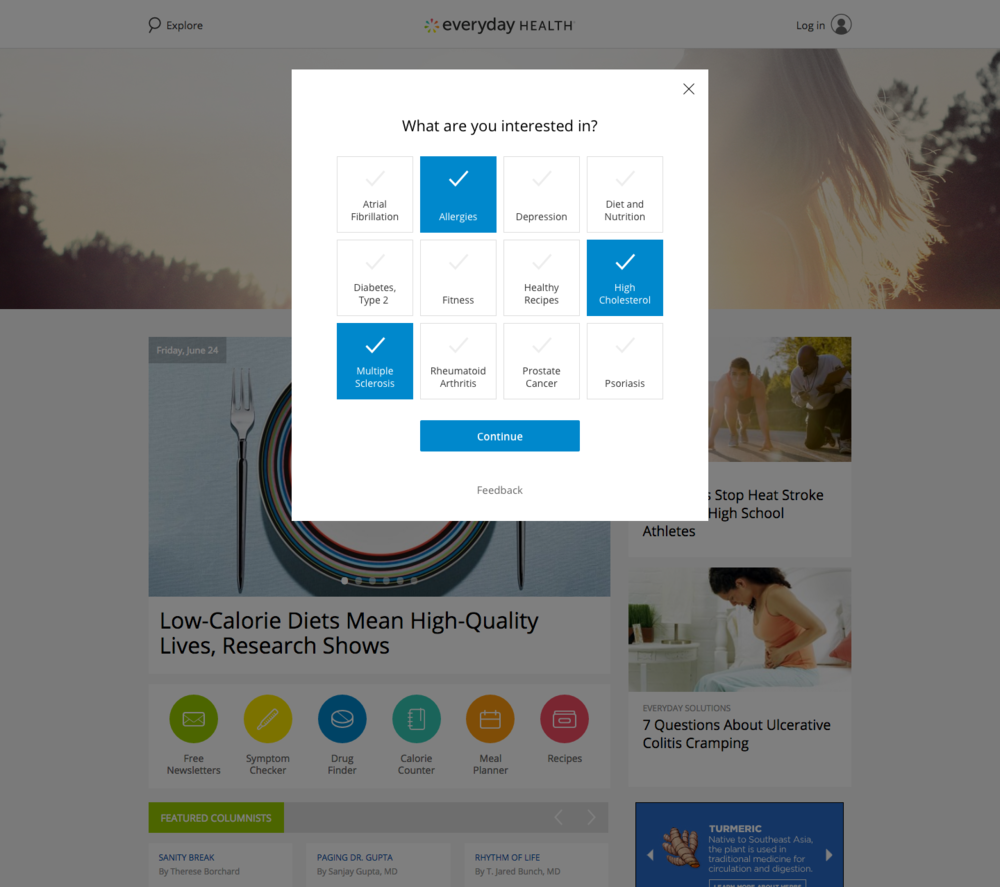
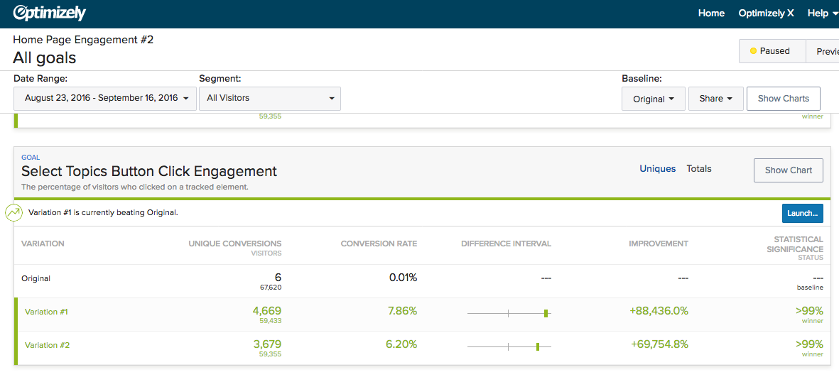
After leading the team collaboration sessions with editorial, product and engineering folks, we decided to run a multivariate A/B test to see whether having a main call-to-action would result in more pages viewed per session. The CTA would be displayed in 2 different variations – the first with a simple dropdown menu containing a list of conditions, and the second with an overlay where the user could select multiple topics and personalize their experience. Also each variation would have different language and button labels.
The first variation with the simple dropdown menu ended up performing better than the first (7.86% vs 6.2% CTR). This was attributed to mobile traffic, which accounted for 70% of the site traffic, as well as the native mobile dropdown menu being a highly familiar interaction. In addition, the first variation was successful overall in that it resulted in roughly 20% more page views per session than the original variation without the main CTA.
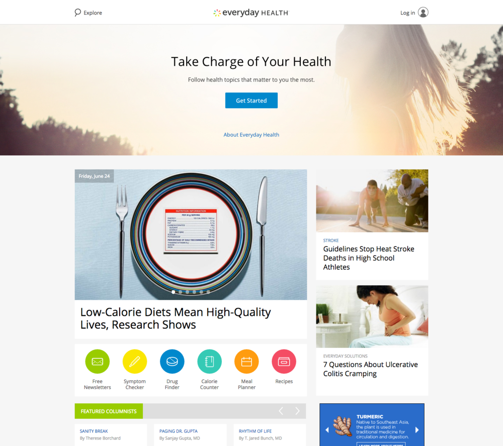
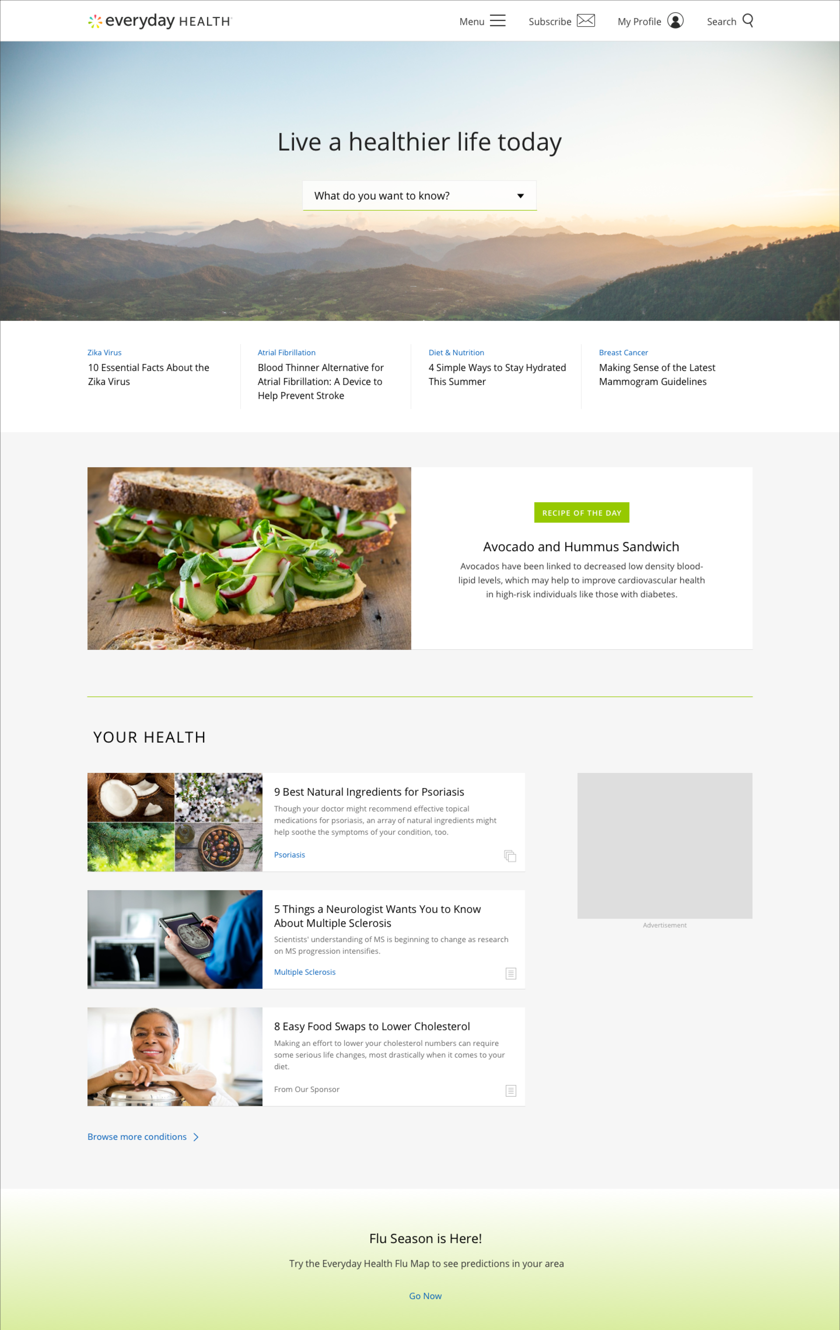
While working with the design team on the visual design, I ran a five-second test to see what kind of images users to which responded more positively. Most users had positive feedback to images that “looked out” into the horizon, in an aspirational way, along with language that supported it. Users responded negatively to the night images involving the use of time parting, as well as bright sun. The former because this users did not go to the home page multiple times a day. If they see a nighttime image once, they thought the site was about sleep! The later because users felt “blinded” by a rising or setting sun. Good to know!
The rest of the requirements were pretty straightforward, listing content for both lifestyle and medical, as well as promotional feature links for the Recipe of the Day, Flu Map, Cancer awareness, etc.
Photogallery
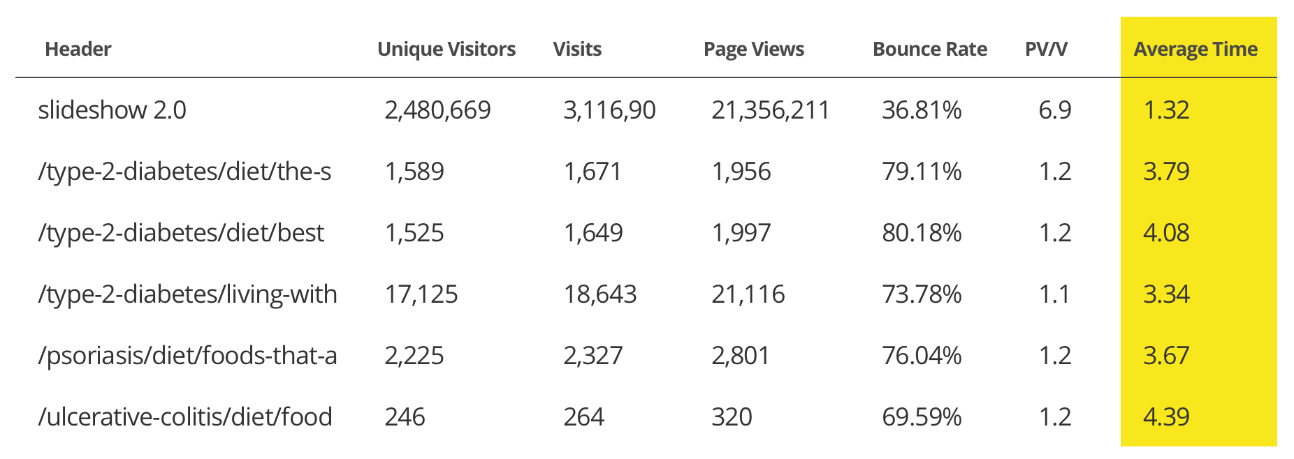
The existing slideshow template (slideshow 2.0), where users click “previous” and “next” to view content in slides, accounted for the highest percentage of page views on the site of any template. It also had a low bounce rate. On the surface everything was fine, especially from an ad sales perspective.
I had a suspicion though that users were not fully satisfied with the experience and ran a user test to get some feedback. It was eye-opening in that users were somewhat repelled by the experience, worse than I would have thought and in favor of the alternative scrolling experience. Feedback like “clicking to view content is a hastle!” and “this seems like clickbait” were revealing of users’ attitudes to the current UI. It was also a good experience as a team to watch the reactions together.
The team ran a test where they “unrolled” a few existing slideshows into single page vertical experience. The results were such that the overall average time spent (3.86 minutes) on the single page experience was significantly higher than the current experience (1.32 minutes). So based on both the qualitative and quantitative data, we felt confident in moving forward with the wireframes, working with ad sales to determine the correct ad placement to visual design and the launch of the new experience. The result is that users engage more deeply for a longer period of time, and from a business perspective, view just as many ads.

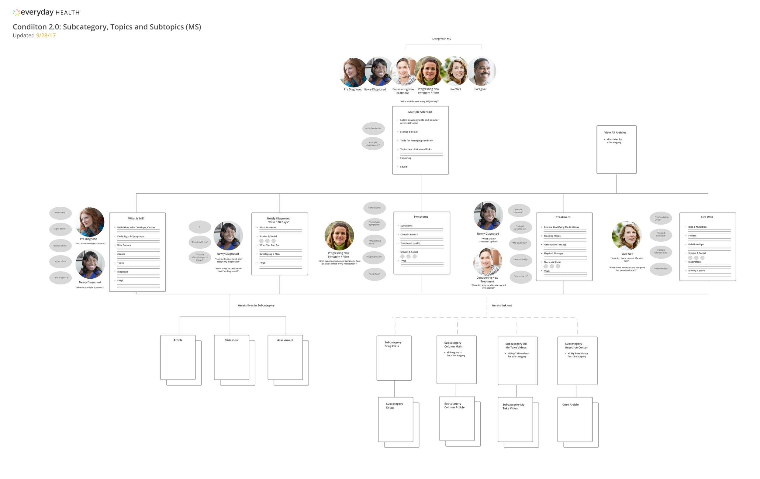
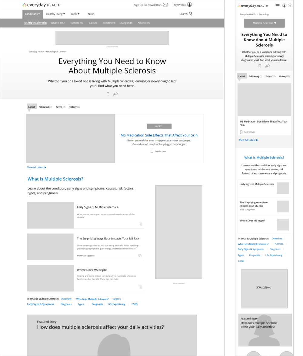
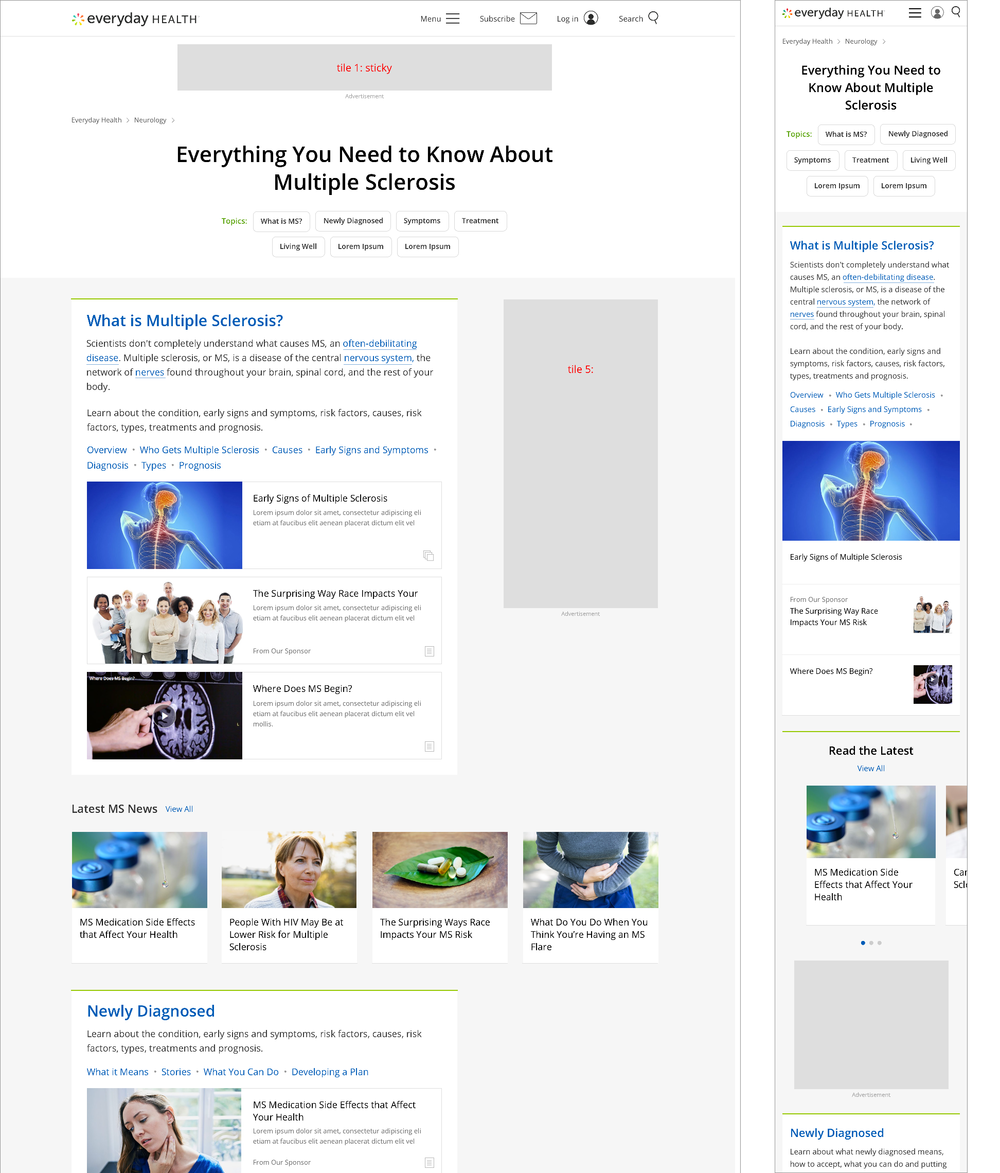
Condition Centers
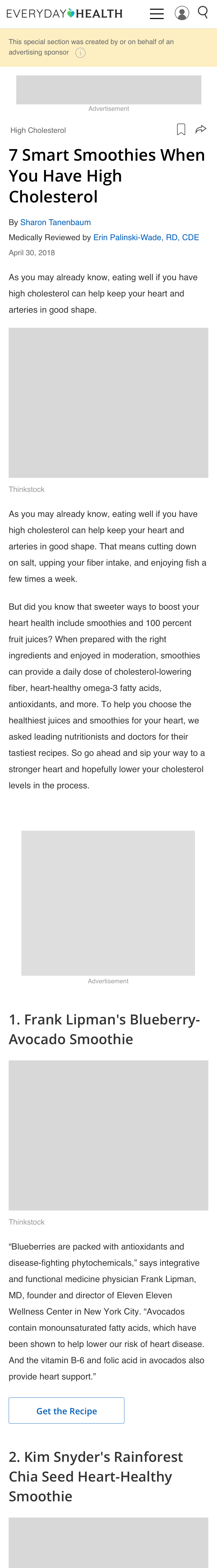
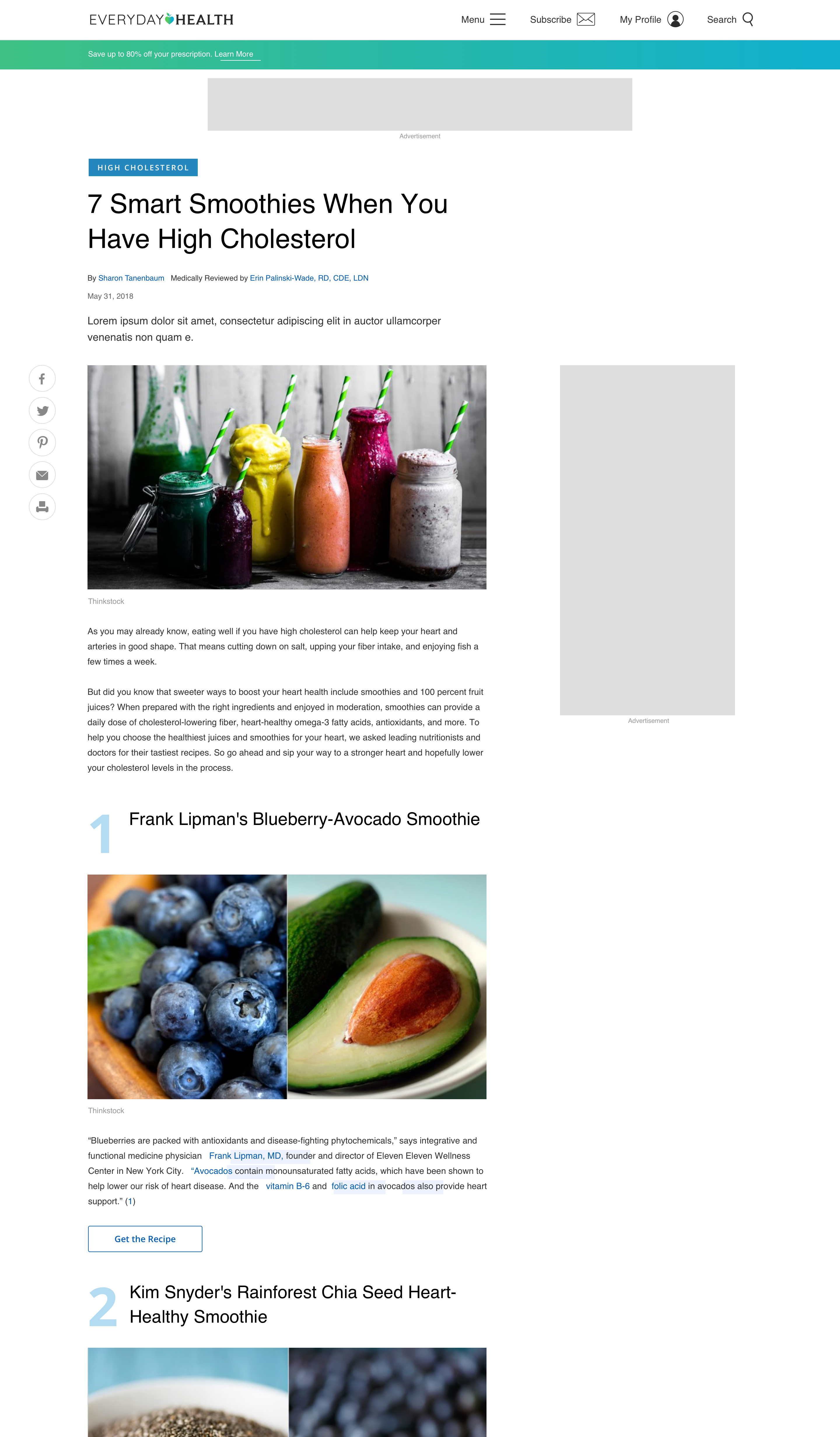
The Condition Center Landing Page provides a destination for users to find information about their condition and inspiration on how to live their best life whether they are pre-diagnosed, newly diagnosed, looking for treatments, or living with a condition for months or a lifetime. The structure and hierarchy of the condition center was then based on these different types of users.
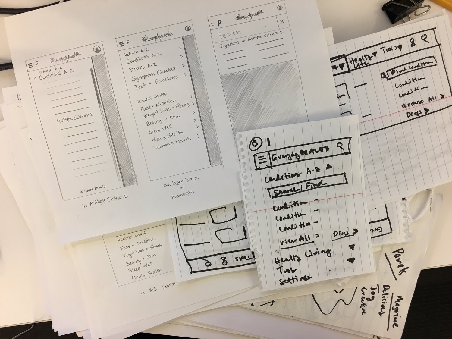
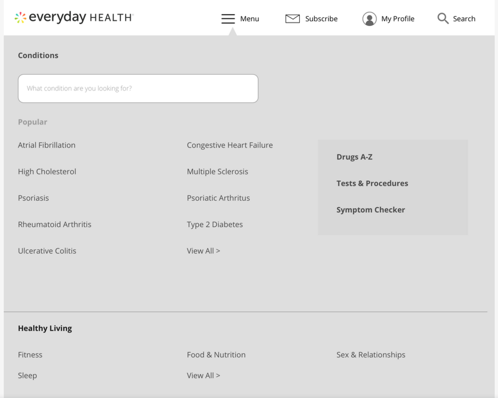
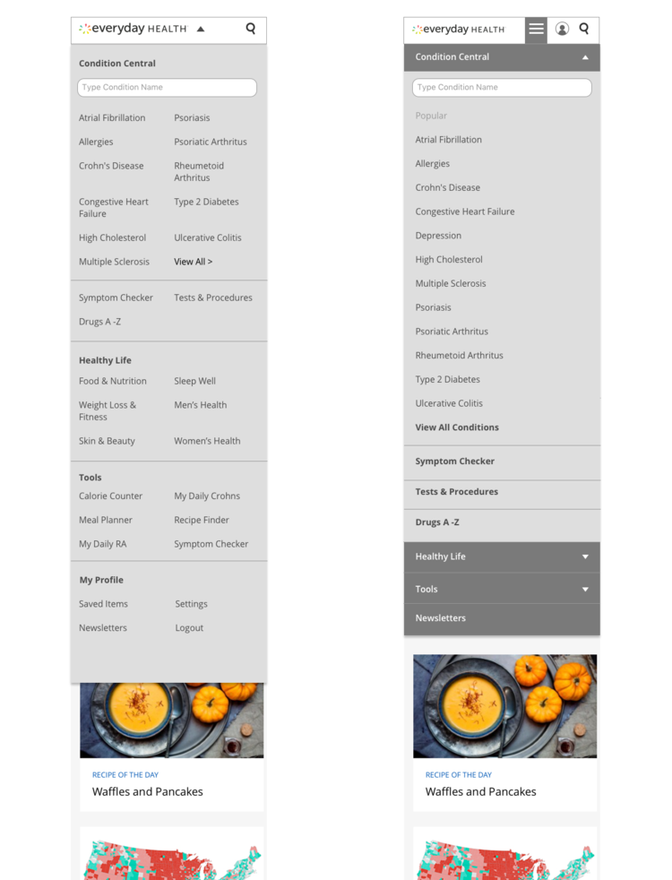
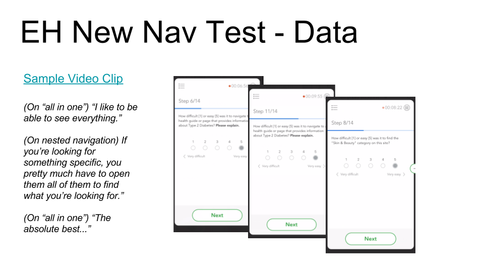
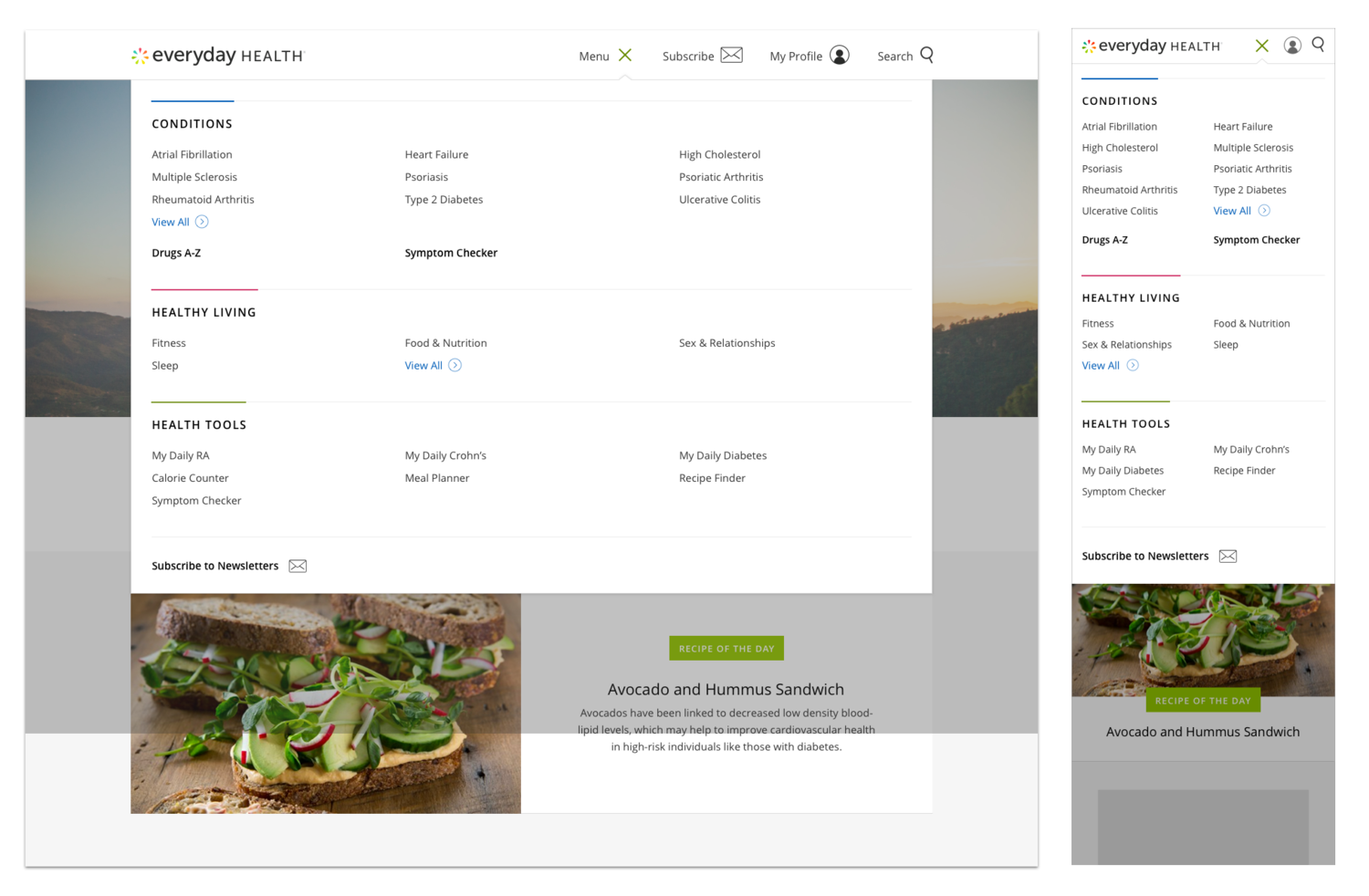
Global Navigation
Working with sketches from a team brainstorm session, I prototyped and user-tested different navigation models including the nested and single-overlay models using real Everyday Health content.
The single overlay model performed the best, since users could click into one single location to quickly choose from all the condition and lifestyle topics that could potentially contain an article such as “Recipes for Diabetes”. Users had more difficulty when they had to make a decision of going down one nested path or another for the type of condition-related wellness content that Everyday Health publishes.