Personal Black Box (PBB) allows users to manage their data that apps collect about them. It’s a project that I worked on with Mohr Design. I led the charge from comparative research, user flows and wireframes to UI design, user testing and the handoff with annotations and a style guide. The project took about 3 months.
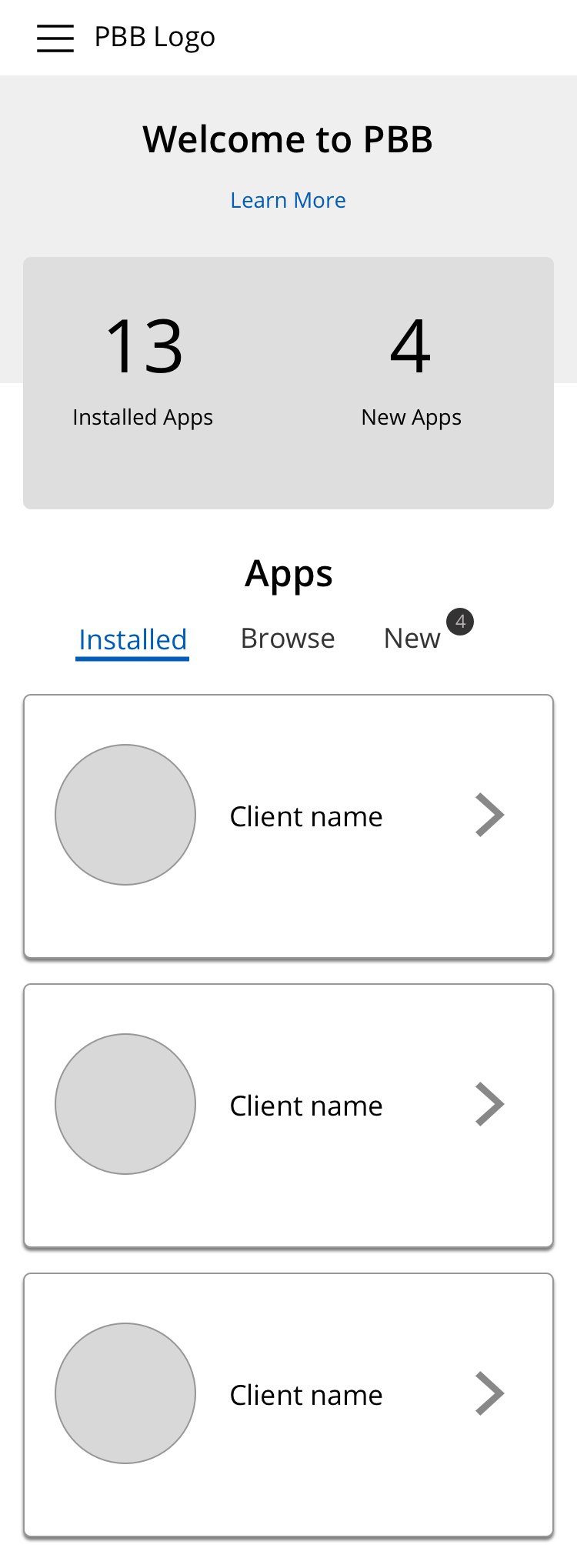
PBB as a startup had a functioning prototype that we reviewed at the kick off as well as some data structures. For the first release, we decided to focus on 3 user stories:
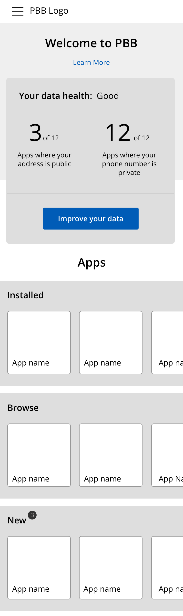
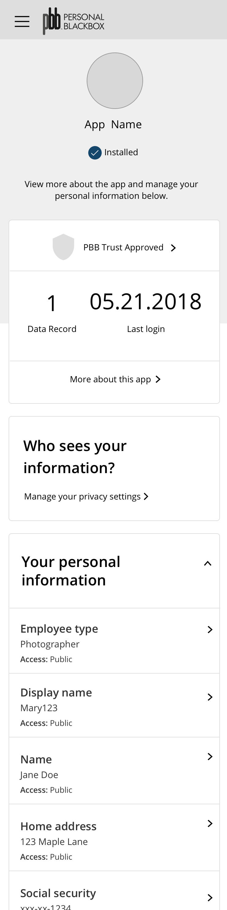
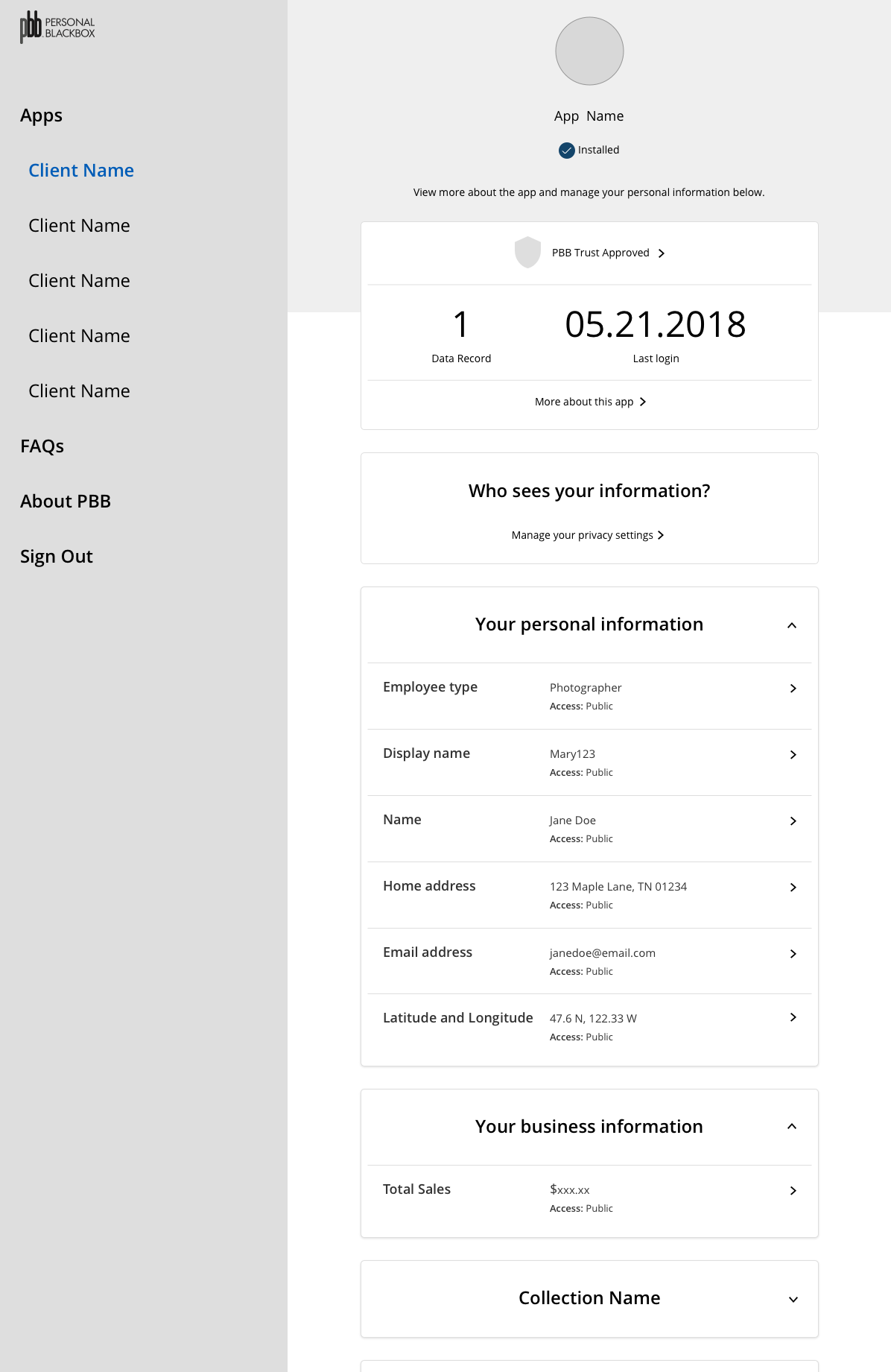
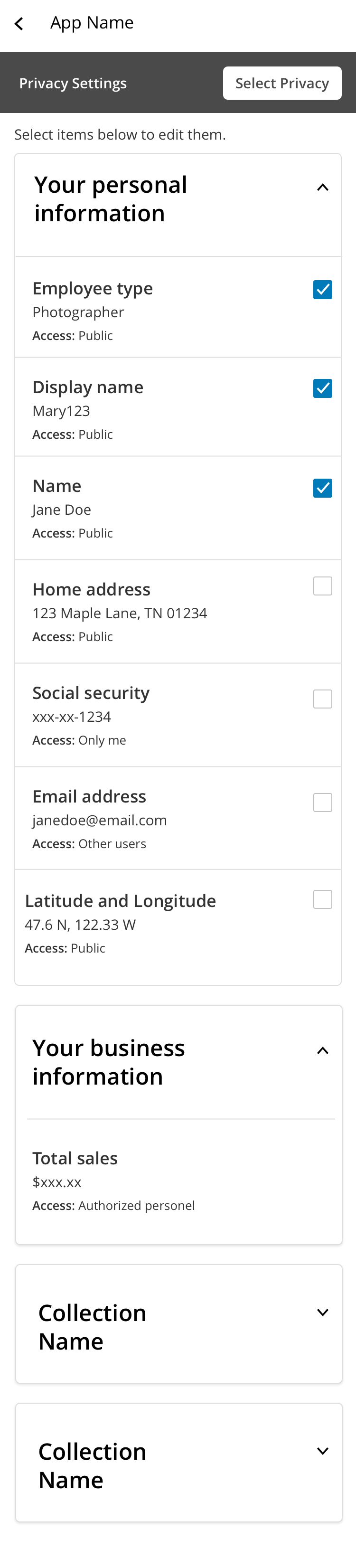
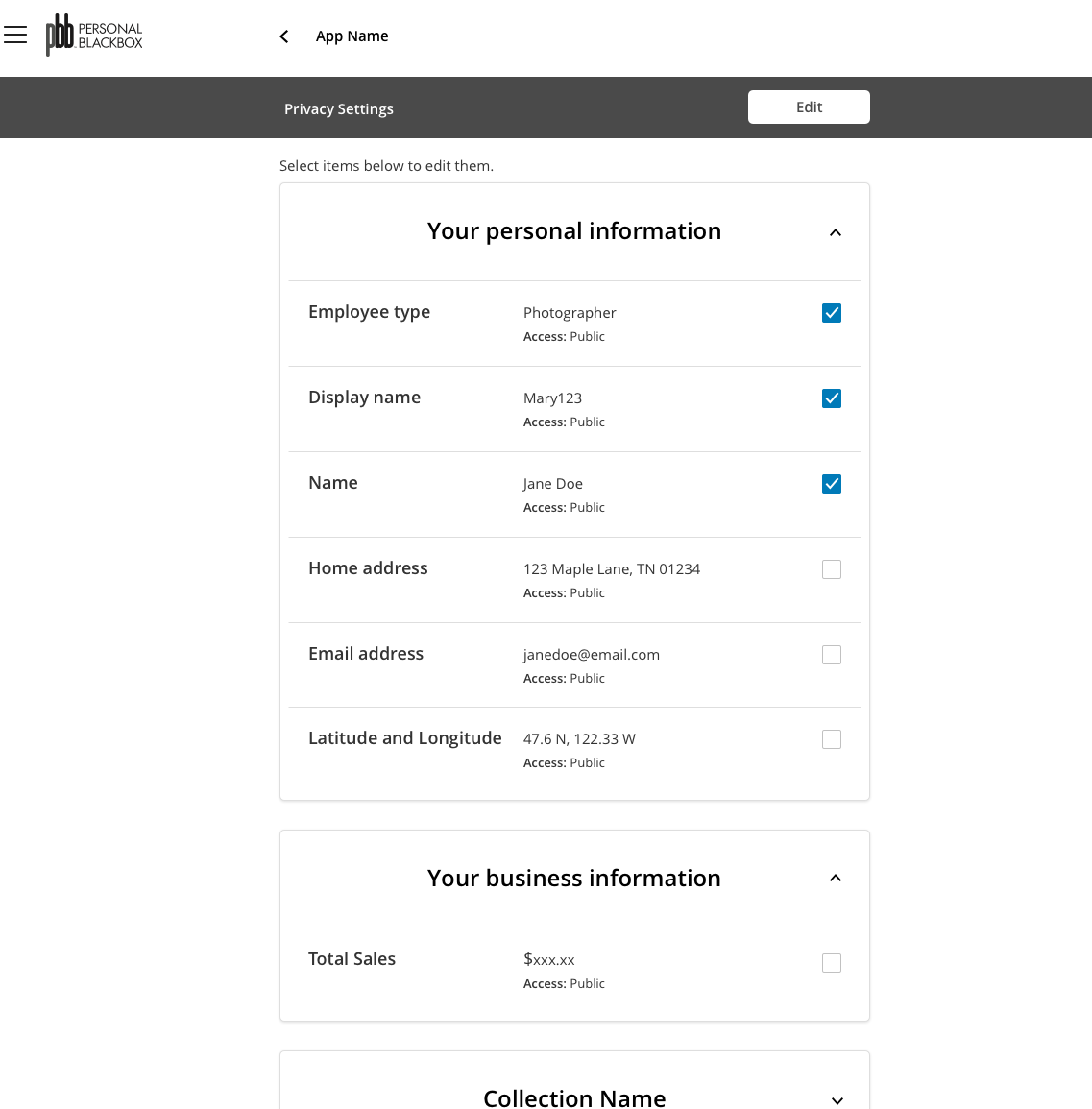
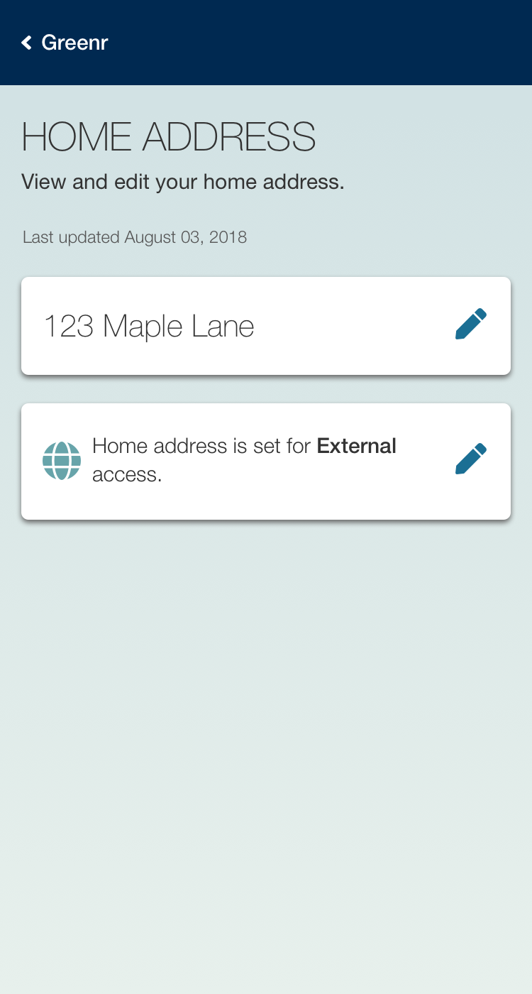
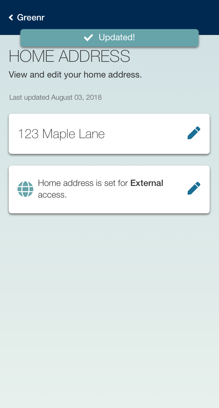
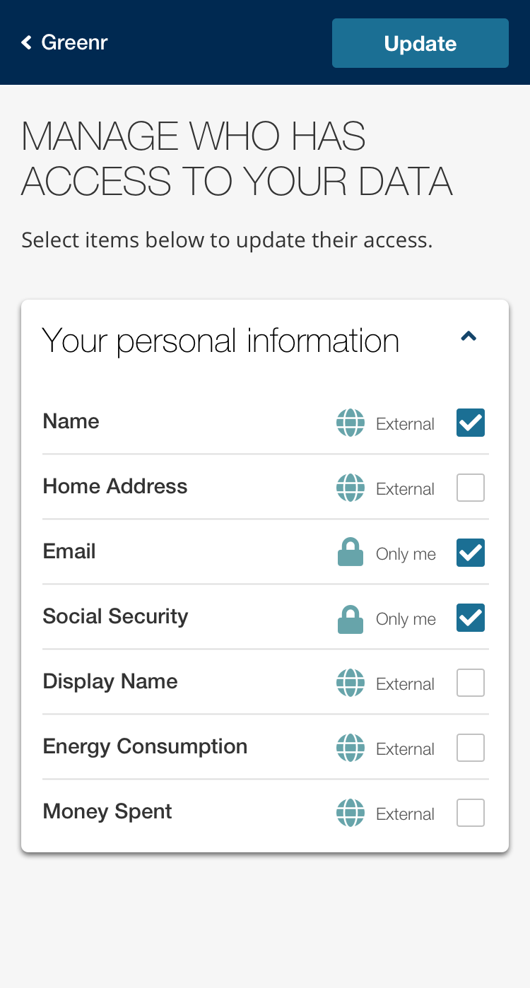
1) View their data
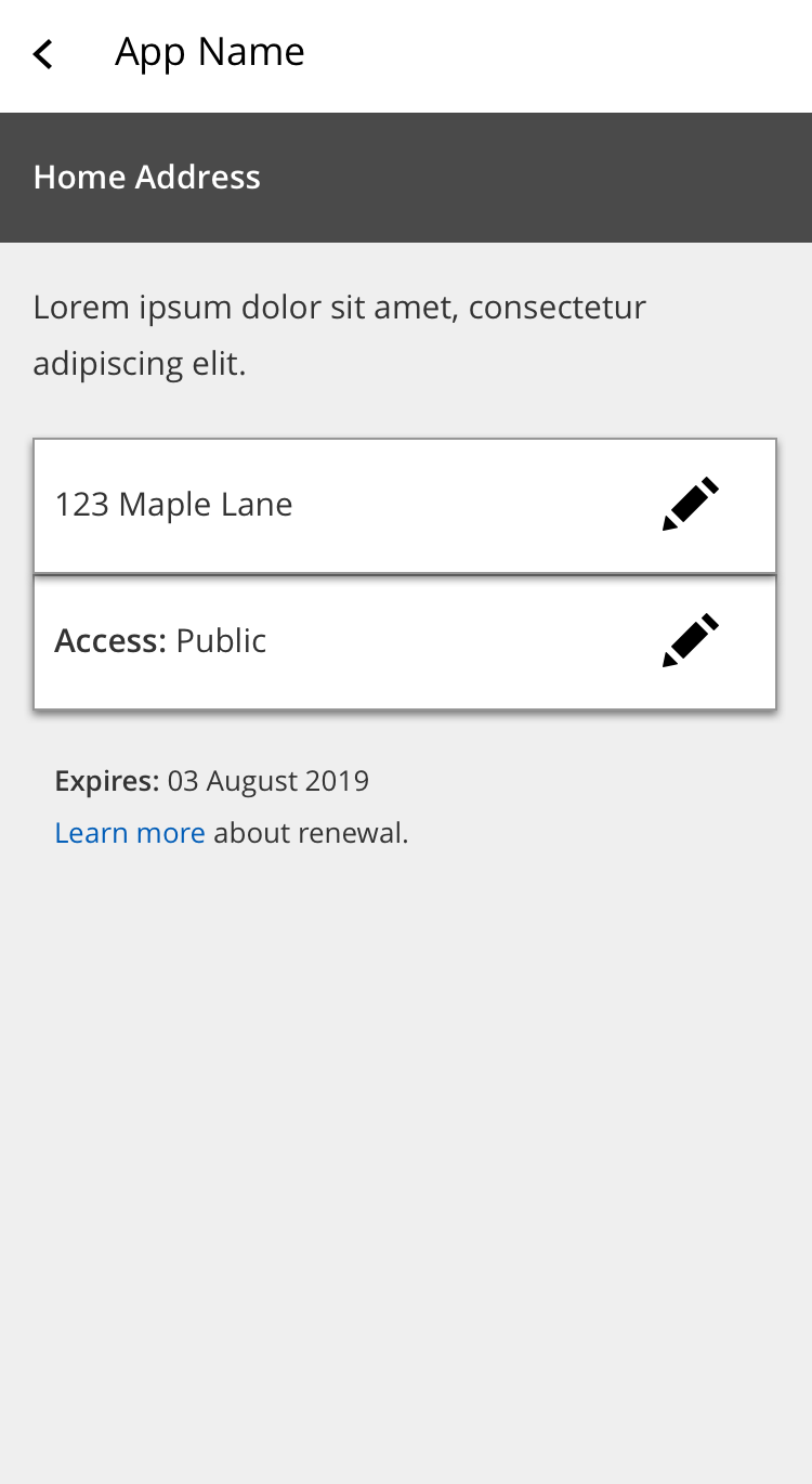
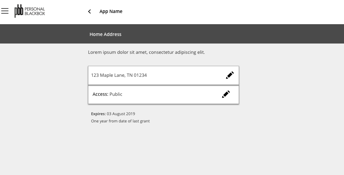
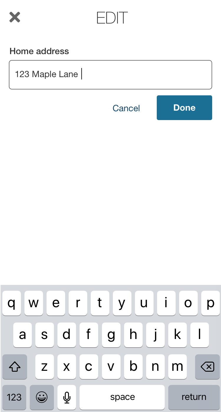
2) Edit their data
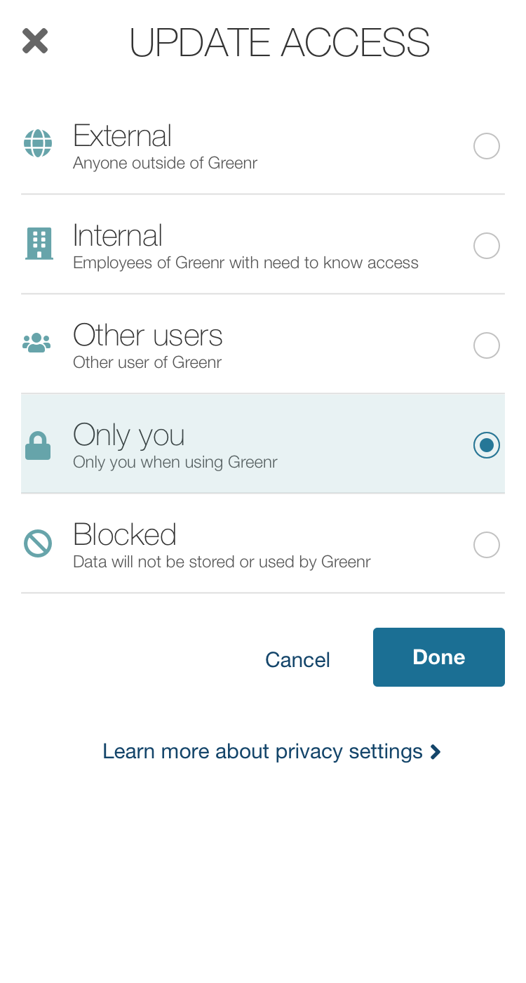
3) Manage access to their data
Research
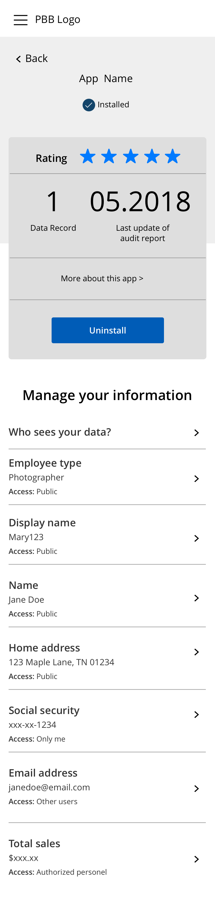
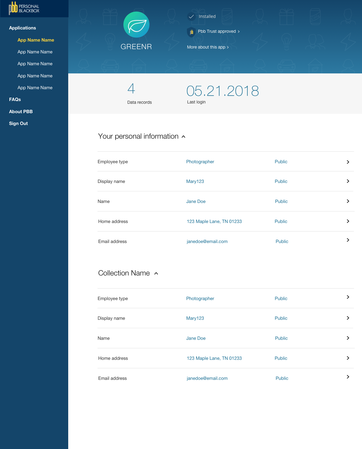
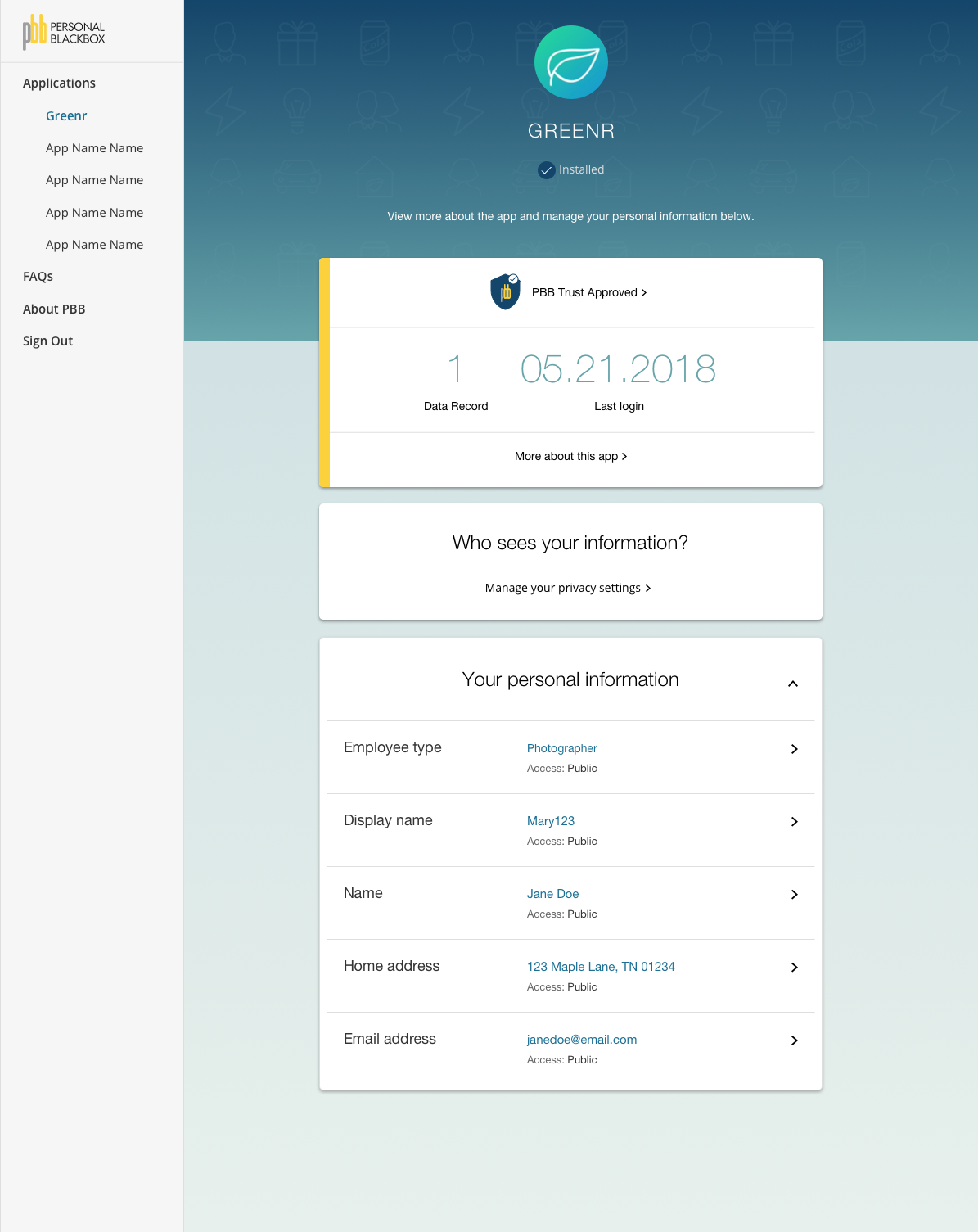
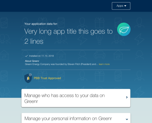
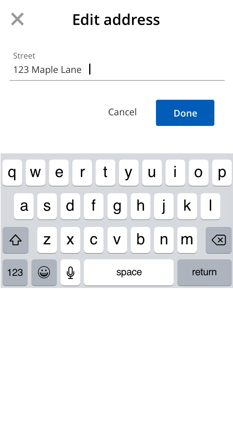
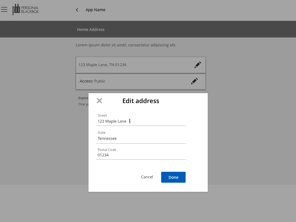
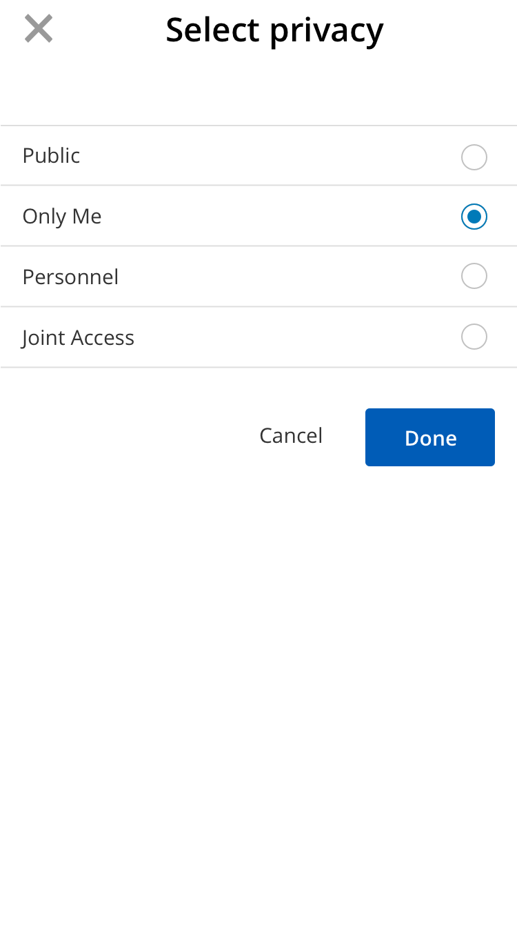
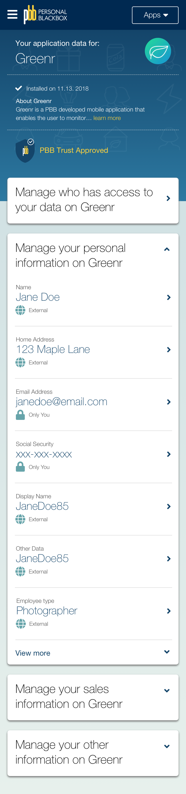
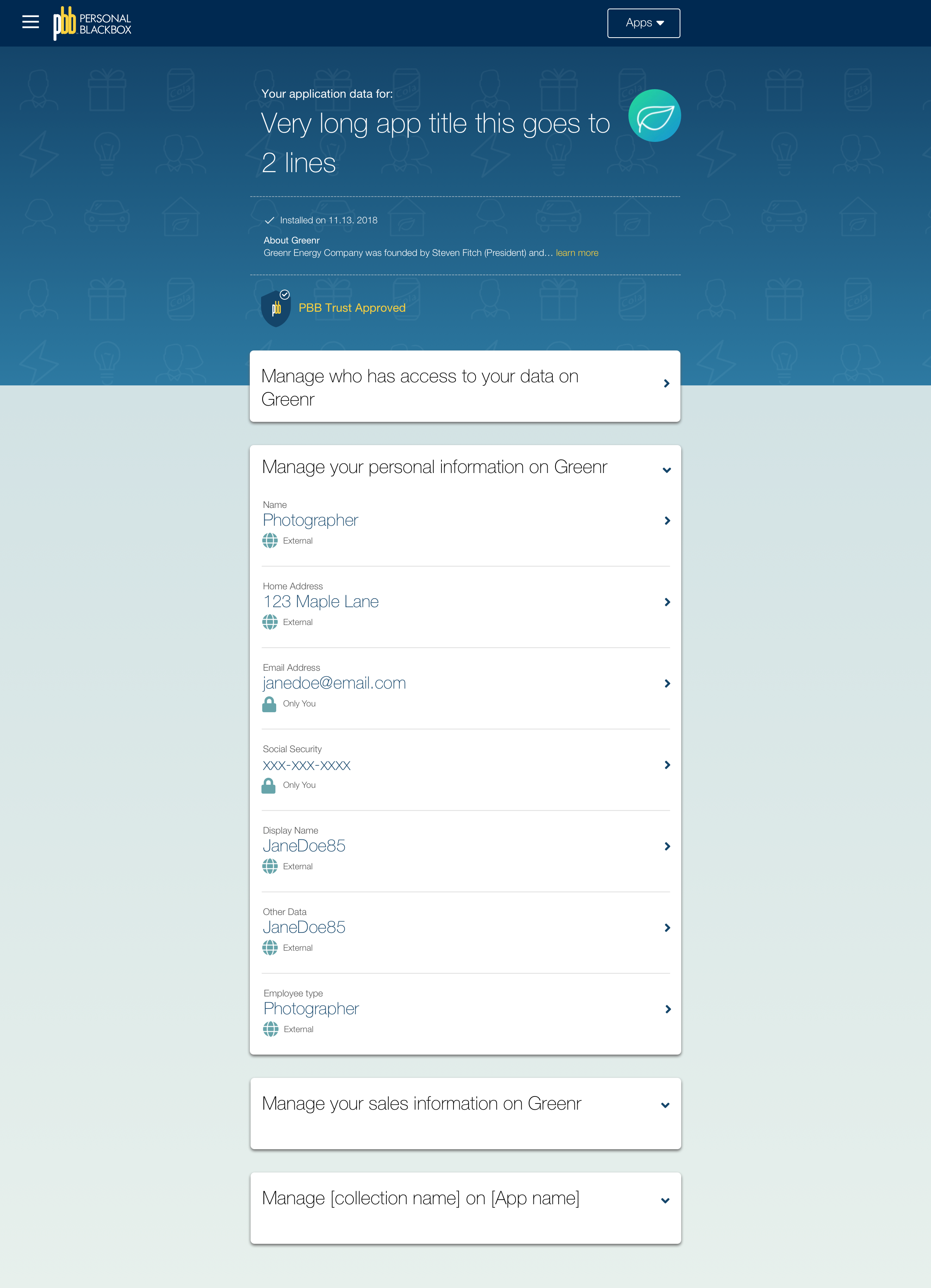
We knew that there would be different metadata about the entries. For example, in addition to managing access to a user’s address, there is information about the address that would be displayed for each entry. So each entry needs to be thought about uniquely with multiple relevant data points .
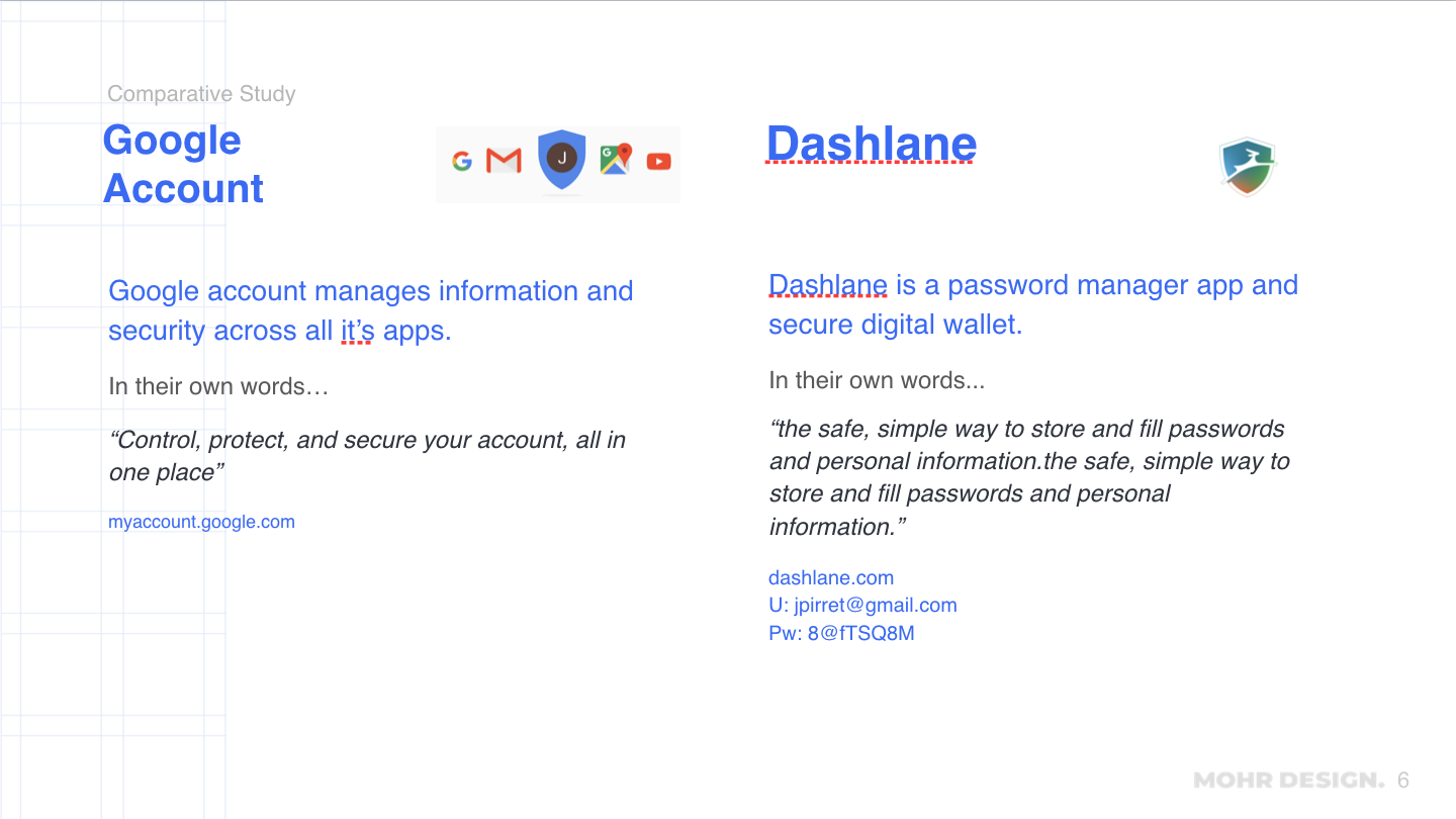
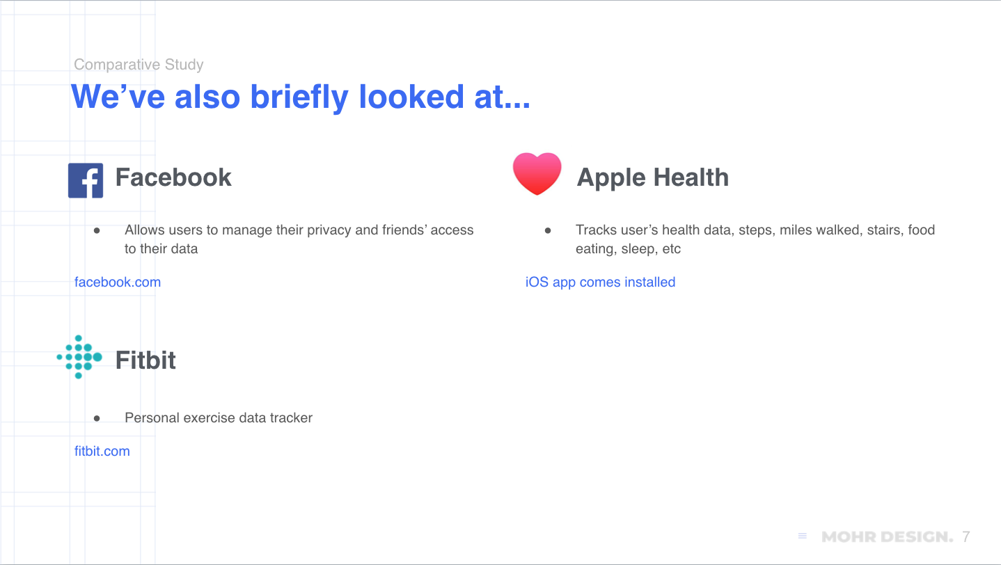
Some applications came to mind immediately, such as Facebook, where users can manage what their Friends view about them. Also this is happening in the midst of GDPR in the EU, as well as data privacy issues for the major tech companies. Both Google and Facebook had just released tools for users to manage their data. In addition we looked at Lastpass, Dashlane where users are managing data for multiple accounts, as well as Fitbit, where the user is getting updates on their health and activity.
For the different apps, we looked at the UI and any other major features. The idea of “data health” is starting to come into prominence. We also wanted to be sure to look deeply at mobile interfaces, and think about that as a selling point for PBB as well as an efficient way to develop from the beginning.
Userflows and Wireframes
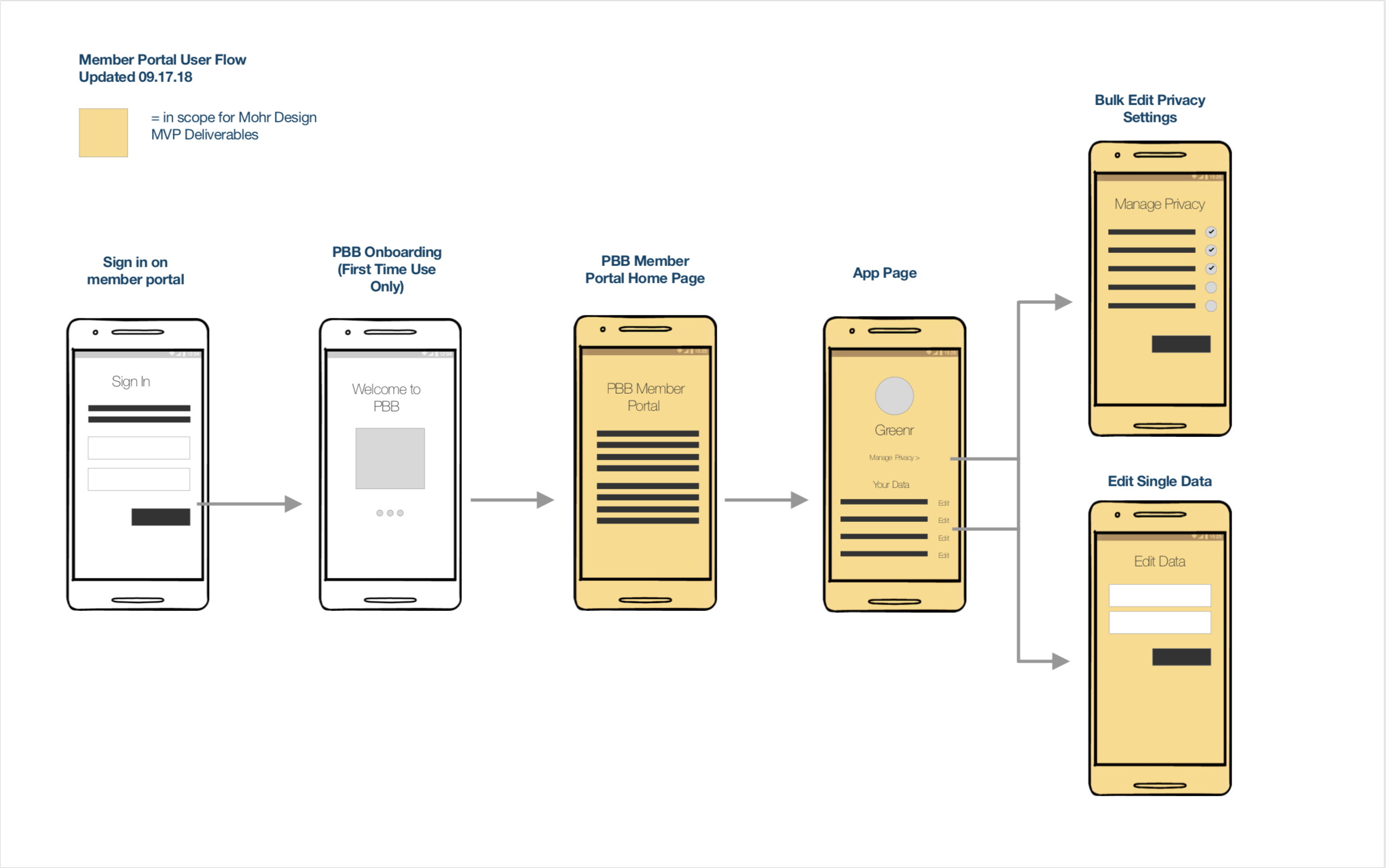
From there I created some basic user flows that outlined where the 3 use cases might occur. This is a starting point for the wireframes and also outlined the scope of the work visually. Then I created 3 different models to look at the 3 use cases and in addition, included a concept of bulk editing privacy access for different fields.
UI Design and User Testing
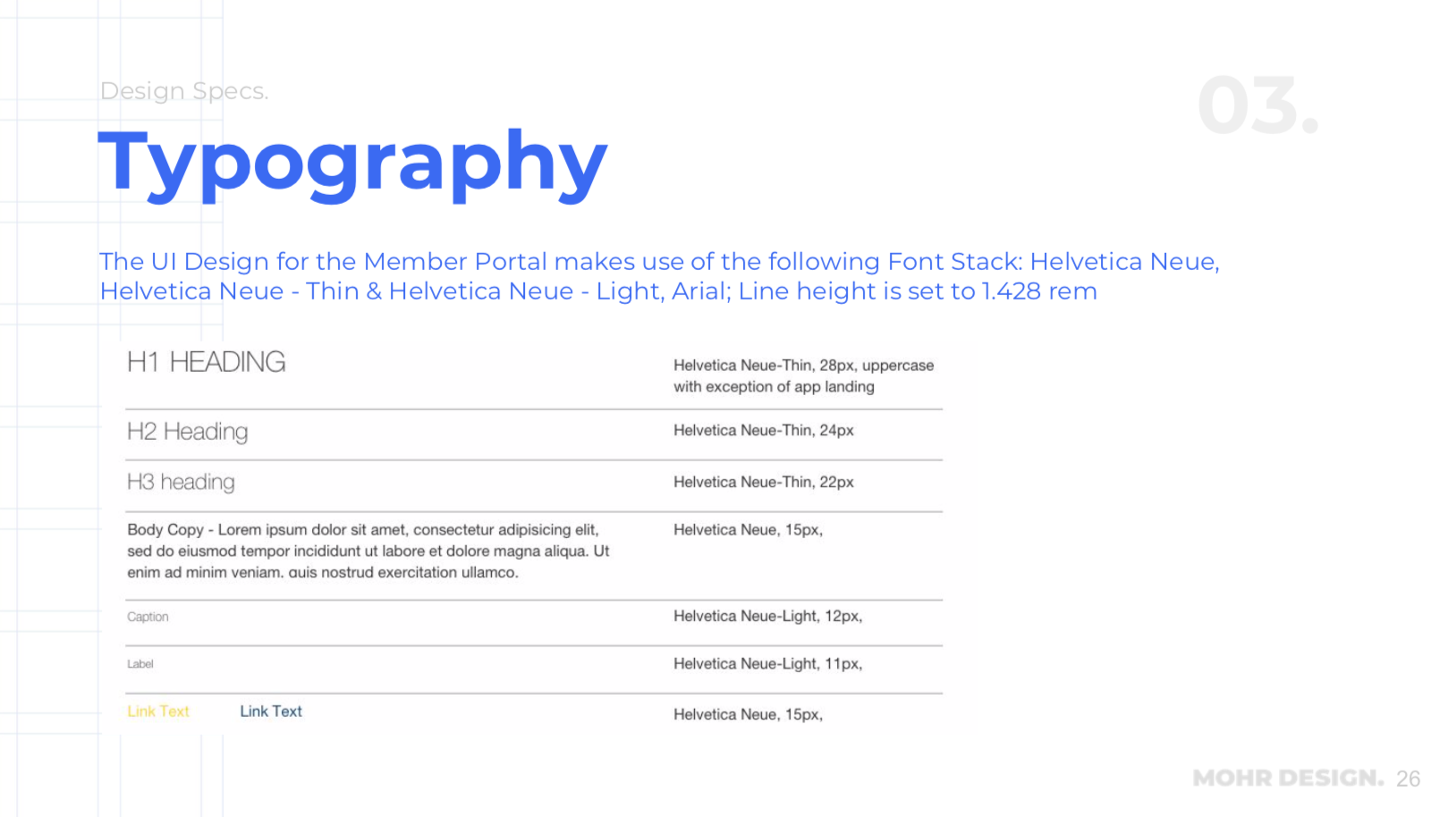
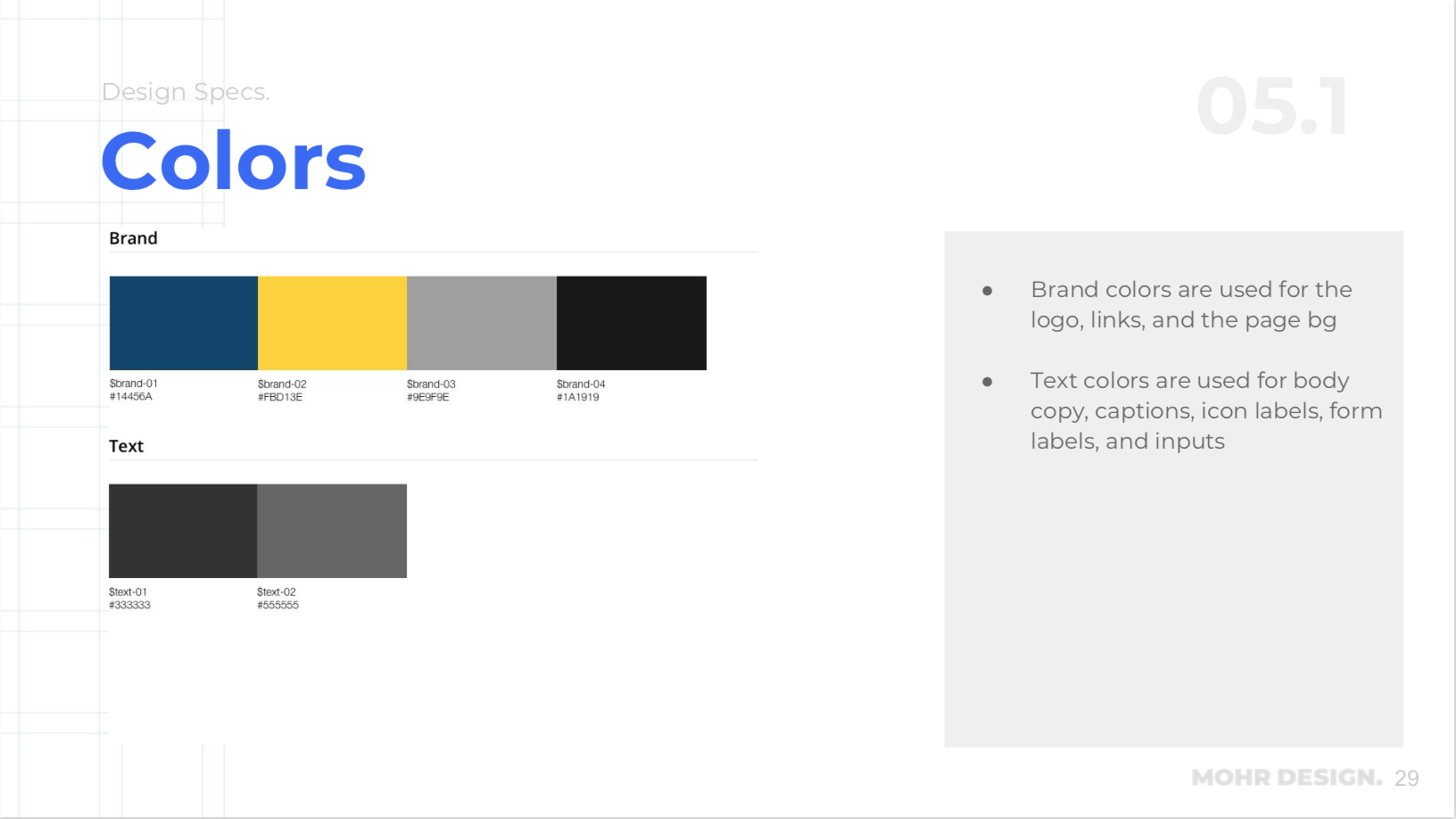
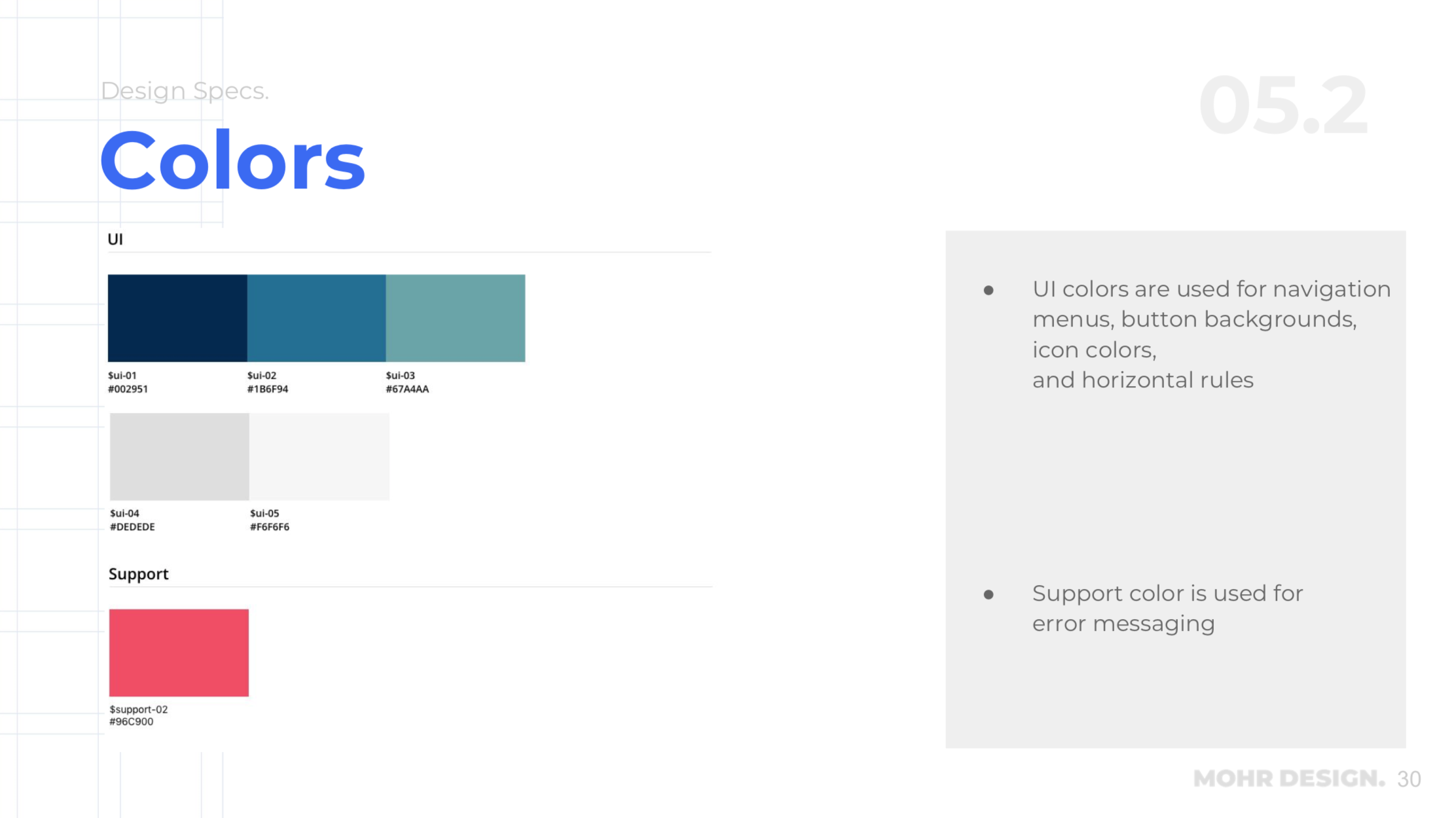
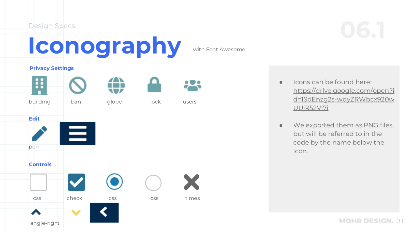
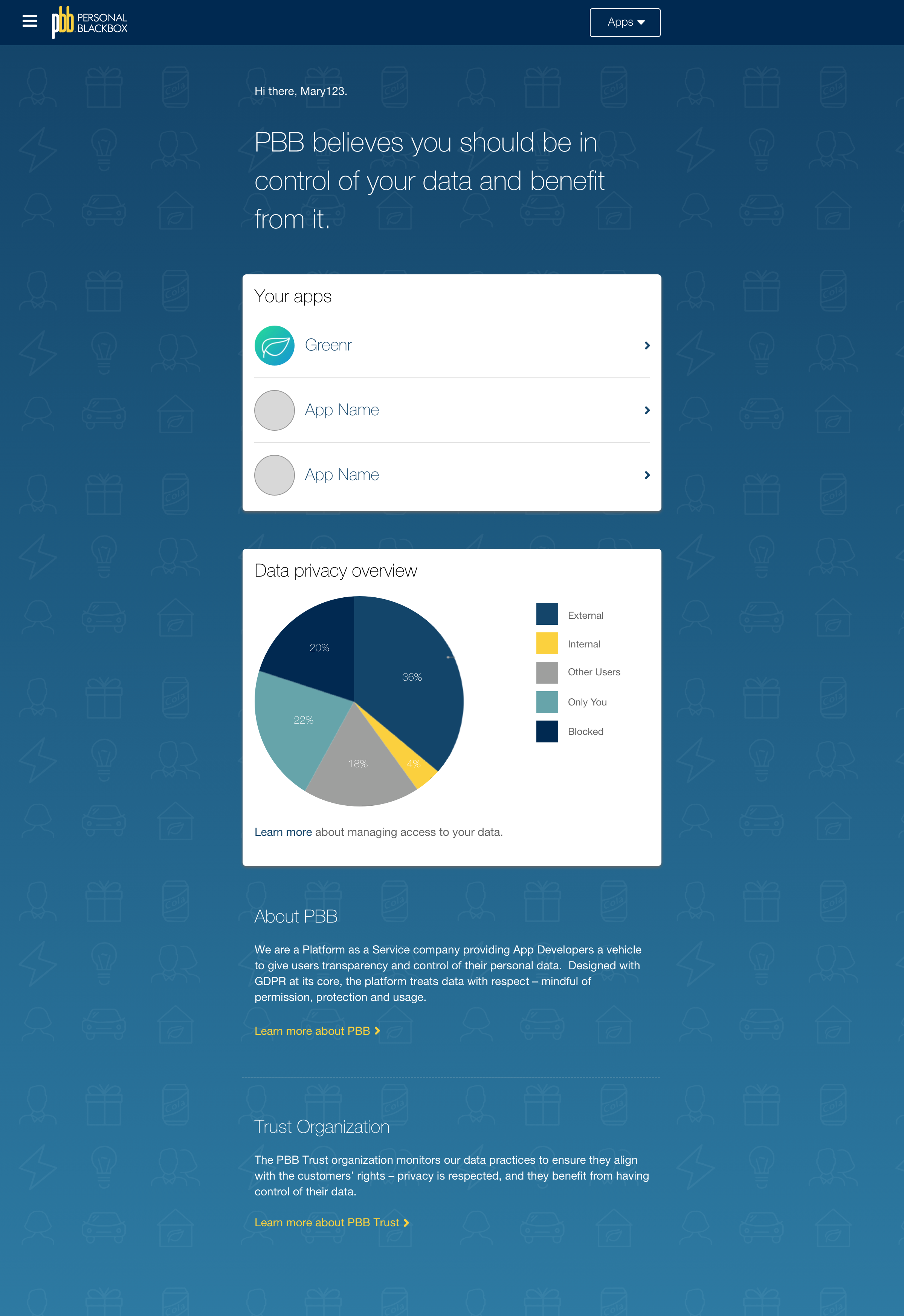
At this point with a lot of the functionality worked out in the wires, it was about refining the typography, iconography and color palette. We based much of this off of the current PBB.me, which is the marketing site for the app so the two products would have a coherent look and feel. A new icon set was added in using Font Awesome.
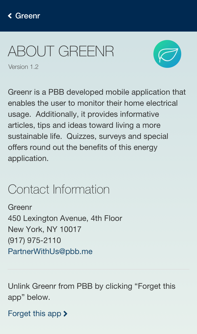
In user testing, we found that users had a little trouble understanding that the overarching app was PBB, not the individual app. So we had to minimize the prominence of the individual app (Greenr) and including PBB branding throughout the experience. Also including information “About PBB” was important to users. Viewing and editing data was understood clearly.

Handoff
Since we were not going to be directly involved in the development is was important to hand off a full interaction spec and style guide, which was created with React variables in mind.